shaping the vision: the design evolution at iriver
jun 2007 - dec 2009

StoryThis is the story of how, during a focused and impactful period, Yeongkyu Yoo—in his role as Creative Director— established a new design language and integrated a cohesive visual system across all aspects of the brand.
Ed Boyd’s presence and role as Global Creative Director at Nike (now retired) left a profound impression on me and served as a major influence and my north star throughout my career. When I moved from Nike to LG Electronics, I expected to take on a similar role, but due to various constraints, it was difficult to fully realize those expectations. After successfully completing a key project, I accepted the offer to become Creative Director at iriver. At that time, iriver was seeking a fresh start, and during my first executive interview, I met the best CEO and planner I have ever encountered. The co-CEO who offered me the position was a close friend and entrusted me fully with design authority and trust, providing the decisive opportunity for me to join iriver.2007

Establishing a Reimagined Design Language and Proving It in the Market
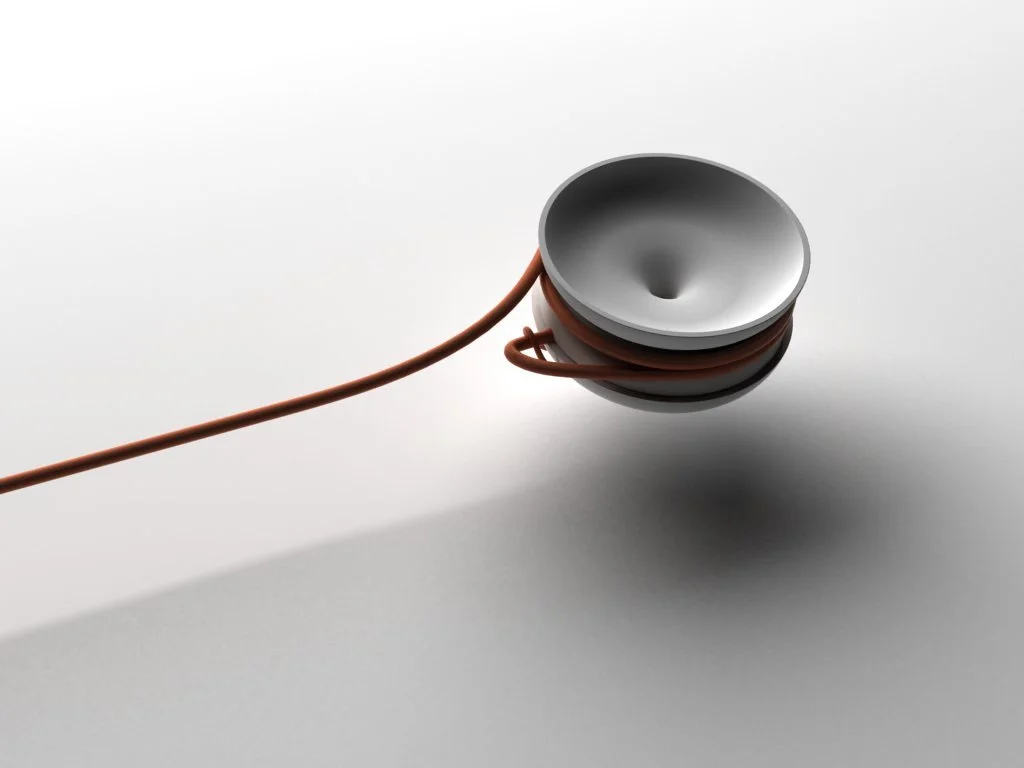
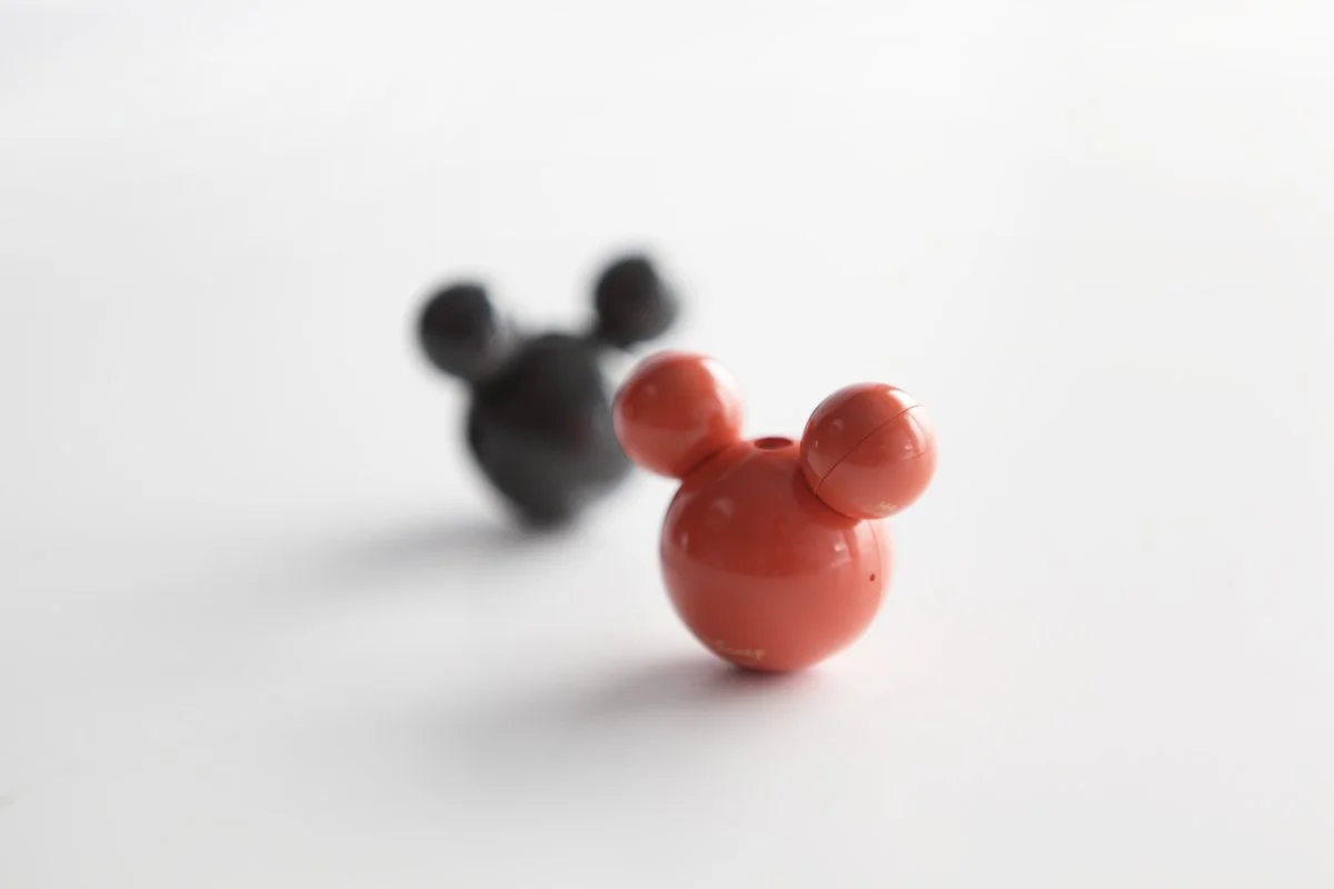
At my first interview with the company executives, I was introduced to the unreleased Mickey Mouse-shaped MP3 player, the ‘M Player.’ Its design—three simple spheres perfectly balancing form and function—made a lasting impression on me. I was deeply inspired by the vision of the original designers, which became a powerful motivation to establish a new design language for iriver. However, while the product design was remarkable, the packaging was cluttered, the colors uninspired, and the marketing overly sexualized. I took bold steps to infuse Scandinavian design sensibilities, reshaping these elements into a refined aesthetic unique to iriver. After joining the company, I immediately headed to the prototype studio and created 60 color samples, introducing 10 sophisticated low-saturation tones to the market—a confident statement of iriver’s new design direction. Despite Apple’s dominant presence in the market, consumers began buying this product in pairs, sparking a remarkable response. Through this success, we validated the new design language’s direction. The ‘M Player’ marked a pivotal turning point, shaping the future of iriver’s design.1

Right before the first launch, I redesigned the kitschy packaging to be minimalist, inspired by a New York trip to add the 'floating package' concept.


We took a bold approach by launching ten different colors, and it was a huge success. One customer even bought several to match their fashion style.

Make the Mplayer express emotions.

01 A concept where customers can build or customize the product their way.

02 Me : A concept where customers can fully personalize every aspect of the product, from features to design.
2008
Good design is good business. – Thomas Watson Jr., former CEO of IBM
A Cohesive Design Strategy for Brand Renewal
When I joined iriver, the company—once celebrated as an innovation leader—was navigating a difficult period and searching for new growth opportunities. Acknowledging the gap in cutting-edge technology and development capabilities, I focused on strengthening iriver’s competitiveness through distinctive and strategic design. Recognizing the need for a unified and powerful brand voice, I reorganized the team so that UI, marketing, and brand visuals could collaborate seamlessly within the design organization. This allowed us to align packaging, product design, UX/UI, retail, and exhibition design under one cohesive brand narrative. Rather than pursuing breakthrough technologies that were beyond our capabilities at the time, we strategically aimed for a balanced integration of realistically achievable technology and bold, innovative design.
ID
Industrial Design Language: iriver Industrial Design has focused on preserving a minimalist philosophy while thoughtfully incorporating elements that add market appeal. My goal was to create a unique design language that resonates deeply with consumers, even within the constraints of engineering and limited resources. Each product launch has enjoyed strong popularity, demonstrating that this direction effectively balances our design principles with market demands.
photo - iriver design group
2008


2009

2009

2008


2008

2009

2009

2008


2009


2008
UX/UI


2009 ML UI: Revolutionized traditional UI concepts and launched it in the market, seamlessly blending sophistication into the hardware for ultimate harmony. The large grid functions as an easy-to-press button while evoking the feel of a sleek magazine layout.

Boldly implemented flat UI for the first time in the industry to achieve refined consistency in design language.


Enhancing usability and delight through a unique combination of physical and software UI.


Enhancing usability and delight through a unique combination of physical and software UI.

Squarecle Icon: Born from the continuity of iRiver's industrial design language.
Where Inclusivity Meets Elegance : Integrating the UX team into the design team was a transformative process that pushed boundaries. It took considerable time and effort to get a deep understanding of this field, but that challenge led to some groundbreaking results. I embraced a bold approach by implementing flat UI early on, pairing it with an innovative, magazine-style design that effortlessly complemented the hardware. The introduction of square UI was a game-changer, setting a new standard in the industry. We then ventured into uncharted territory by combining physical dials with screen UI, creating a truly multisensory experience. This fusion of hardware and software wasn’t just functional—it was a statement of iRiver's distinctive design language, merging usability with a unique sense of creativity and elegance.

Iriver's latest PVP, dubbed the P7, has an interface unlike any we've seen before.
"Iriver appropriately describes its main menu screen as magazine-like, laying out each of the player's functions on a single screen, compartmentalized into an attractive arrangement of boxes. " -- CNET" In 2007, I merged the UX team with the industrial design team, which allowed me to achieve a strong consistency in our design language. This approach enabled us to boldly apply designs that were uniquely 'iRiver'—both distinctive and usability-enhancing—to the market. One standout example was the 'Magazine UI,' a completely new style that went beyond the industry's first use of flat UI. It was a design that had never existed before, and bringing it to life involved overcoming significant challenges. There was a lot of concern from decision-makers since the concept was unconventional at the time. With limited resources, I worked closely with a junior designer, collaborating directly to bring the project to completion. Despite these hurdles, the design debuted to great acclaim at CES. However, one regret was that the use of low-cost chips prevented the natural fluidity we had envisioned for the UI's motion." - Yeongkyu YOOPackaging


Reimagining Packaging: iriver’s Bold Step Towards Sustainability
At iriver, we’ve redefined what packaging can be. It’s no longer just about protecting a product—it’s about creating something meaningful, sustainable, and beautiful. We’ve stripped back unnecessary printing, focusing instead on the tactile elegance of embossing and debossing. But the real shift came with our “re-valuable design” concept—packaging that doesn’t end its life when it’s discarded. Instead, it transforms into something functional, something worth keeping. It’s a simple idea with profound impact, and it’s how we’re leading the conversation in sustainable design.
Exhibition & Store


“iRiver made arguably the strongest design statement at C.E.S. this year. The Korean company has recently undergone a rebranding under the aegis of its creative director, Yeongkyu Yoo, who left Nike to reinvent the electronics maker. Everything we saw — the slick, white exhibit enclosure, the light-box display cases, the product packaging and the chic products themselves.”
- The New York Times
“I saw it as a critical step in refining the overall design integration and elevating it to its highest standard”
“ During the process of integrating design language from product to packaging, I was always frustrated by the inconsistent visual messages coming from the marketing team at consumer touchpoints. Every meeting with them felt like a repetitive cycle of evaluating external designs, and I could see my time and energy being wasted on inefficient discussions. Eventually, I was given full control over retail and exhibition design by the company CEO. Although this added even more responsibility to my already heavy workload, I saw it as a critical step in refining the overall design integration and elevating it to its highest standard.
At exhibitions like IFA in Europe and CES in the U.S., I designed the space to reflect iRiver’s unique identity. From selecting materials and fonts to the final setup, I was able to communicate iRiver’s message more clearly. After the exhibition, the immense creative effort I poured in felt worth it, even though I lost a few kilos in the process. The white, floating booth at CES, built with a very limited budget, stood out and caught people’s attention, playing a key role in boosting iRiver’s global brand recognition.
Retail was no different. Instead of the usual rigid product service spaces, we launched the first-ever 'iRiver Lounge' in Korea— a space inspired by the feeling of a café. This innovative store concept was groundbreaking at the time and successfully communicated a fresh brand image to our audience “ - Yeongkyu YOO
“I’m jealous of Yeongkyu Yoo who is the creative director of iRiver. I worked with him at Nike and when I visited his booth at CES, he introduced me to his upper management and everyone separately told me that they were here to support Yeongkyu’s vision. Yeoungkyu had complete creative control and everything from the product to the booth was done under his direction.”
- Scott Wilson ( Former Creative director at Nike )
Domino — Founded a Design-Driven Brand

Domino project : Crafting the Voice of Design.
Established Domino, a Design-Driven Brand where design takes the lead in every decision.
By expanding the responsibilities of the design team, it embodies the value of a brand that integrates and collaborates across all processes, from product planning and industrial design to sales, in a more solid way. It was born to uphold the commitment of maintaining a consistent vision from start to finish, aiming to build trust that remains unchanged over time.
“
The design team was responsible for everything from product planning and design to making sure the design principles were reflected in the places where the products were sold, offering consumers a transparent and clear voice
”
I was responsible for retail and design at domestic and international trade shows, proving the powerful impact of design integration in the market. During this process, I worked on strengthening iRiver's product design but felt that seeing products scattered in electronic stores was disrupting the perfect design voice. However, given the challenging situation at the company, I chose to pursue a new experiment rather than take the risk of changing the retail environment.
This led to the creation of the Domino brand. The design team was responsible for everything from product planning and design to making sure the design principles were reflected in the places where the products were sold, offering consumers a transparent and clear voice. One key differentiation was having the design team decide early on where the product would be sold, which traditionally was the role of the sales team. I believed the MoMA Design Store in New York would be an ideal first location for Domino, so I went there and met with the curator, resulting in our first sale.
Additionally, I presented the product to Kenya hara, the art director at Muji at the time, and received positive feedback. He even mentioned, 'Sony should wake up.' Afterward, I met with the representative from Muji, and they expressed a strong interest in selling the product. Unfortunately, after I left iRiver, progress on this front came to a halt. The product quickly gained recognition in the market after its release, and I had plans to expand the lineup and further solidify the design team’s role. However, after leaving iRiver, these plans were no longer able to move forward, which I regret.
Designing Tomorrow: The Heart of Teamwork, Motivation, and Vision in the Design Studio


As the head of the design group, I worked on strengthening the team's capabilities while envisioning and gradually implementing three dreams for the future of the design center.
First, much like Philips’ “Vision of the Future”, the goal was to define and present a forward-looking vision for iriver—crafting innovative designs, technological advancements, and comprehensive product strategies that align with the company’s future aspirations.
Second, to continually inspire our in-house designers and nurture their creativity, I aimed to foster collaborations with brands we admired. These collaborations encouraged us to dream bigger and explore new possibilities. Notably, partnerships with MUJI and Groovisions came to fruition as part of this initiative.
Third, the ultimate vision was to evolve iriver’s design capabilities into a global design studio, akin to BMW Designworks—a consultancy that provides creative and innovative design solutions across diverse industries while continuing to champion iriver’s design identity. This vision began materializing as our design expertise gained global recognition, leading to design requests from international companies.
“I had initially outlined simply as an idea, in the same way BMW Designworks or Philips Design Group’s Vision of the Future had done”
“ I spent several years at iriver, with days so busy that there was no distinction between night and day. Yet, the process of seeing results was an invaluable reward, driving me to work with strength and passion. Over time, the design language began to take shape, and as the designers adapted to this new language, I gradually stepped back from the micro-design management approach I had initially implemented. This was also the period when the designers started to seek more independence from me.
As I reached the peak of leading the design group, I began to realize the future of the design group, which I had initially outlined simply as an idea, in the same way BMW Designworks or Philips Design Group’s Vision of the Future had done. Fortunately, the plan began to progress smoothly, but as it advanced, I regretted not being able to find the right global talent to take responsibility for this business. One of the most exciting moments for me as a designer was when the CEO of B&O personally visited iriver's exhibition booth and invited us to their headquarters for discussions on design collaboration. However, it was a missed opportunity that I couldn’t visit the B&O headquarters due to the IFA exhibition in Europe. Similarly, while there were design collaboration proposals from Motorola and many other global companies, I had to put a halt to those projects because of the ongoing internal workload, which was a great disappointment.
As the head of design, this was an incredibly valuable period where I achieved many successful executions, but also realized areas where I still had much to learn, all in a short amount of time.”

The Conclusion – The Journey of 2 Years and 7 Months
My two years and seven months at iRiver were the busiest and most intense period of my design career, filled with passion and deep dedication to the company. Without exaggeration, I devoted nearly all of my time to creating exceptional designs.
Launching over ten products per year at a small to mid-sized company requires repeatedly iterating through many more concepts and design revisions. Until the iRiver brand reached the desired standard, I led every product from initial concept through to production, deeply involved in both design and execution. My hope at that time was that within about three years, the designers would fully understand the brand’s guidelines, allowing me to regain some personal space.
To achieve higher quality at every design touchpoint, I set the goal of ensuring consistency across not only industrial design but also retail and exhibition design. While this significantly increased workload, it also greatly motivated me. Assigning development staff directly to the design team and initiating early-stage sales activities from the design perspective were also innovative measures aimed at achieving greater design coherence.
As my workload intensified, I proposed a streamlined decision-making process to help the CEO and CDO quickly and easily finalize design decisions, thus alleviating bottlenecks. After more than two years, when our products began receiving market recognition for their outstanding design, the CEO's trust in our design team grew stronger, enabling us to make more autonomous decisions—a fact for which I remain deeply grateful.
However, entering the third year, I realized that merely elevating design standards would not suffice to satisfy the increasingly sophisticated consumer expectations. Facing these limitations, I proposed a new, visionary product lineup embodying iRiver's innovative identity, strategically balancing commercial viability with fresh, cutting-edge brand positioning. These products aimed to surpass our previous stylish offerings through technological and experiential innovation, requiring bold moves to stay ahead in a competitive market.
Ultimately, the company chose a safer, more stable path, diverging from the innovative spirit of the early iRiver. Respecting our different perspectives, I decided to leave the company after two years and seven months. Despite our differing paths, I still respect the company’s decisions, maintain a friendly relationship with the CEO, and remain deeply appreciative of his support for our design efforts.
Finally, I express heartfelt gratitude to the 25 designers in the design group who faithfully supported my direction and significantly contributed to creating outstanding products.
Currently, I have received offers from several companies, but I have declined them all. However, if I encounter another great opportunity similar to my experience at iRiver, where I can actively participate with the CEO in key decision-making, I would seriously consider it
All of Us
We came a long way—together. I'm deeply thankful to every member of the iriver design group who brought their dedication and design spirit to the table. None of this would’ve been possible without you.
Daehee Kim, Dowon Kim, Minjung Kim, Sujin Choi, Sanghyun Jeong, Sungjin Cho, Jinyoung Park, Taehee Jang, Semin Jeon, Yong Kim, Mincheol Kim, Eunsol Kim, Changhoon Lee, Wooshik Choi, Dongjin Han, Goeun Han, Hyewon Ok, Deokhee Jeong, Hyunsik Kim, Taeun Park, Sangil Lee, Donghoon Kim, Jiyong Kim
And to those whose names I may have missed—please know that your efforts and presence were equally valued and never forgotten..